Three reasons to use Shapley values
Last time, we discussed Shapley values and how they are defined, mathematically. This time, let's turn our attention to how to use them.1
We discussed how explainable artificial intelligence (XAI) is focused around taking models which have high predictive power (high variance, or high VC models) and providing an explanation of how that model works, or how a particular prediction was generated. The more powerful an inference model becomes, the less interpretable it is, and there are a number of strategies for explaining the inferences from the model.
Shapley values are what we called a surrogate model, or a model of a model. We first train an inference model on the world, and then we train a model with low predictive power, but high explanatory power, on the inference model. Shapley values are linear models. By definition, they are the closest linear approximation of a nonlinear model, and are understood principally through looking at various distributions of the linear contribution of particular features to particular predictions.
There are three popular comparisons to use, in order to understand different parts of the model. From broadest to most specific, these are:
- distributions across the training set
- distributions across other features
- distributions within a specific prediction
From each of these, we can learn:
- the global directionality and magnitude of feature effects
- the interactions between features in the model
- the contributions to an invidual prediction
Let's take a look at each of these one by one.
1. Feature effects
A common reason to want a more explainable model is that yours lacks feature importances (as in a nonlinear support vector machine), or has a notion of feature importance but lacks magnitude and directionality (as in a decision tree or a random forest). Knowing which features have the largest effect is both a way to learn about your model, and, assuming your model is good, to learn about the world.
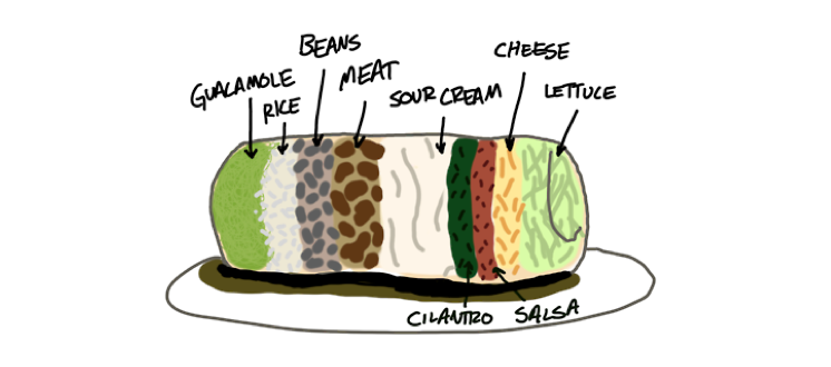
You can imagine, for example a model which attempts to predict how good a burrito will be, based on things like how much it costs, and the ingredients that it uses.2 If this model placed a really high importance on whether or not that burrito contained onions and cilantro, you would feel justifiably skeptical that the model was learning appropriate associations from the data.
In this particular case, the effect of each feature looks bad because the model itself is a high bias model (a linear model), which is not powerful enough to capture the relationships in the data.
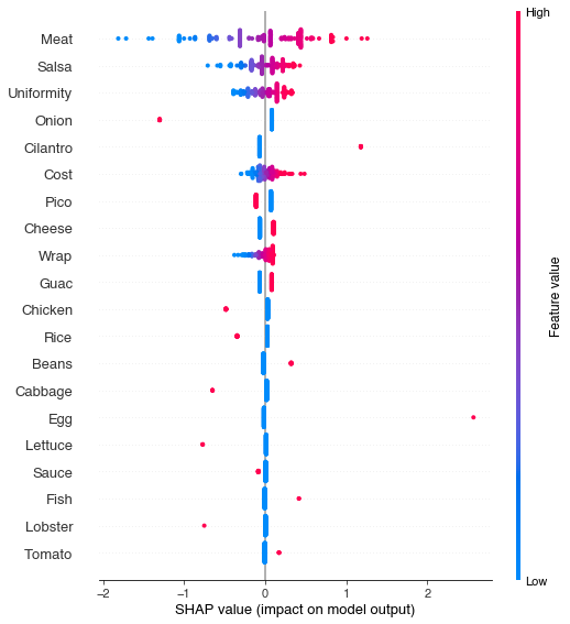
With a more powerful model, the shapley values align more closely with our expectations (assuming that you are omnivorous). The most important features, in order, are the quality of the meat, the salsa, and the distribution of ingredients throughout the burrito (to get a better understanding of uniform ingredient distribution, please see this medium post)
In the remaining values, we observe that the presence of ingredients like onion, tomatos, lettuce, cabbage, and rice, have a negative impact on reported burrito quality. Perhaps these are used as filler ingredients, not to be found in higher quality burritos. When it comes to guacamole inside the burrito, opinions seem divided, and there is not a clear trend to be found in the main effects. It also appears that beef is preferred to both chicken and pork, but this likely reflects the small number of burrito reviewers in the dataset, and their individual preferences.
2. Feature interactions
It seems obvious from the plots above that cost is one of the better predictors of whether a burrito will be ranked highly. In one way this makes sense -- quality ingredients cost money, so it might be the case that ingredient quality increases with cost. On the other hand, you could also imagine a burrito dealer with few scruples, who uses the cheapest possible ingredients but charges a very high price, perhaps because they are located in a burrito desert.
The method for answering these kinds of questions is to look at interactions in the data. An interaction is when the effect of one variable (e.g. cost) depends on the levels of another variable (e.g. the quality of the meat). And indeed for our burritos, we see that this is the case. Cost is a good predictor when it agrees with burrito quality. Expensive burritos with poor quality ingredients actually see a negative effect of cost -- the more expensive they are, the lower they are ranked.
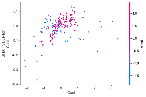
The format of these interaction plots can take a while to get used to. On the x-axis we have the normalized cost score, with the cost getting higher as we go rightward. On the y-axis we have the shapley value for cost, with a better burrito as we go upward. The color of the dots refers to the normalized rating for meat quality -- blue is bad, red is good (also true for most meats in real life). For high quality meat, the shapley values for cost goes up as cost goes up. This is a positive effect of cost. For poor quality meat, the shapley values go down as cost goes up. This is a negative effect.
Interactions can also help us make sense of the confusion around whether or not to include guacamole in our burritos. In the global dataset plots, it was hard to tell whether guacamole was a good addition or a bad one. We can see in the interaction plot that the decision to include guacamole should depend on the quality of the meat.
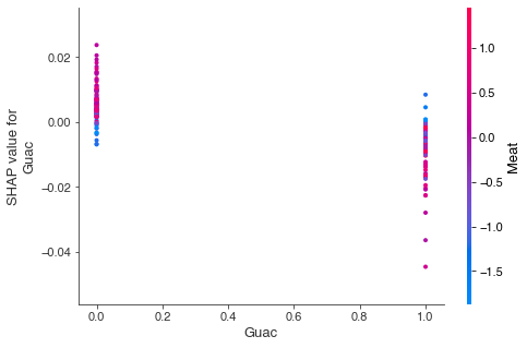
Specifically, the plot shows that guacamole only helps overall burrito quality when the meat is bad. This makes some intuitive sense. If you have a really good carnitas or buche burrito, the last thing you want to do is drown the flavor in guac. However, if the burrito is filled with bland chicken mush, loading it up with guacamole might make it edible.
1. Individual predictions
Finally, we can use shapley values to gain insight into the source of individual predictions, using something called a force plot. These show the difference between the expected value (the expectation over the entire dataset) and an individual prediction, and a function of the summed shapley contributions of individual features.
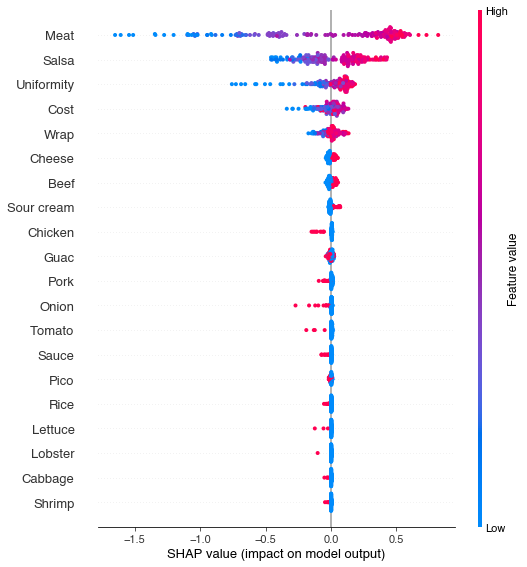
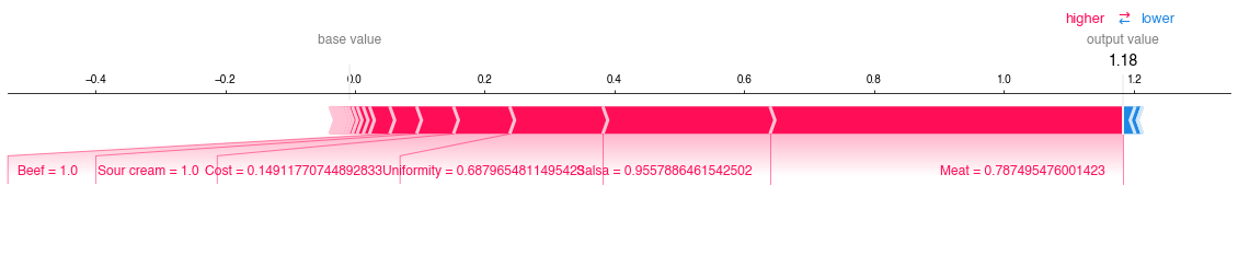
For the best burrito in the dataset, for example, we can see that this was a burrito containing both beef and sour cream, which seem to be favored by the reviewers in this dataset. The effect of these two things is relatively small though, compared to the three globally important features - meat, salsa, and uniformity.
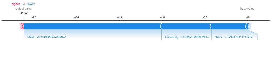
For the worst burrito in the dataset, we observe just the opposite. The quality of its key ingredients is so low, that the other features are barely even visible in the plot.
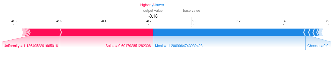
The average case is much more interesting. We see immediately that the largest positive change we could make to this burrito is to improve the quality of the meat. Improving the salsa or the uniformity of this particular burrito will not give us any returns on our investment. There is an additional small benefit to be gained by adding some cheese to the burrito. This might not be worth the cost of purchasing the cheese, but it is something to consider. Were I an aspiring burrito magnate, this kind of targeted intervention is exactly the business intelligence I would be looking for to achieve a stronger market position.
-
this article is based on a lightning talk given at SciPy 2019, viewable here ↩
-
the burrito dataset was presented at SciPy 2017, viewable here. The dataset is available via Scott Cole's website. ↩